
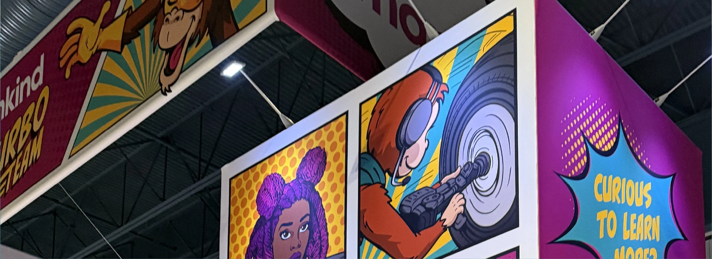
Friends for Life Conference Design
Mannkind - Children with Diabetes
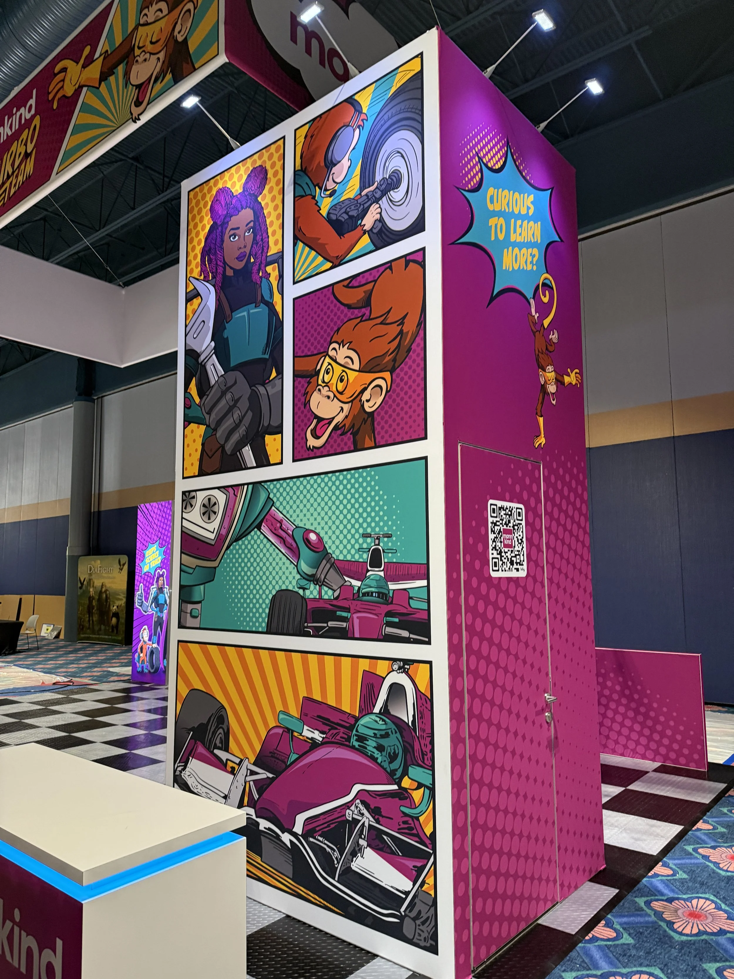
This project focused on developing a superhero-inspired concept for MannKind’s booth and supporting collateral at the Children with Diabetes Friends for Life Conference. By connecting the conference’s superhero theme with MannKind’s rapid-acting insulin messaging and NTT INDYCAR Series partnership, the concept brought the brand’s mission to life through character development, comic-book-inspired graphics, and an engaging, child-centered experience.
Programs Used | Adobe Illustrator, Adobe Photoshop, Adobe InDesign, Procreate
DISCLAIMER:
I take great pride in my work and have served as the designer, or as part of an amazing team of designers, responsible for the work presented in this section. However, I do not claim ownership of the intellectual property, copyrights, trademarks, or other rights associated with these projects. All rights remain with the respective clients, employers, or other rights holders.
My Role and Contributions
Creative Concept Development, Character Development, Logo Design, Illustrator Collaboration, Brand Integration, Booth & Collateral Design
Design Dream Team Mentions
Senior Art Director | Diane Opalenick
Comic Artist | Anthony Smith
Co-Designer | Jesse Segna
My Process
The Ask
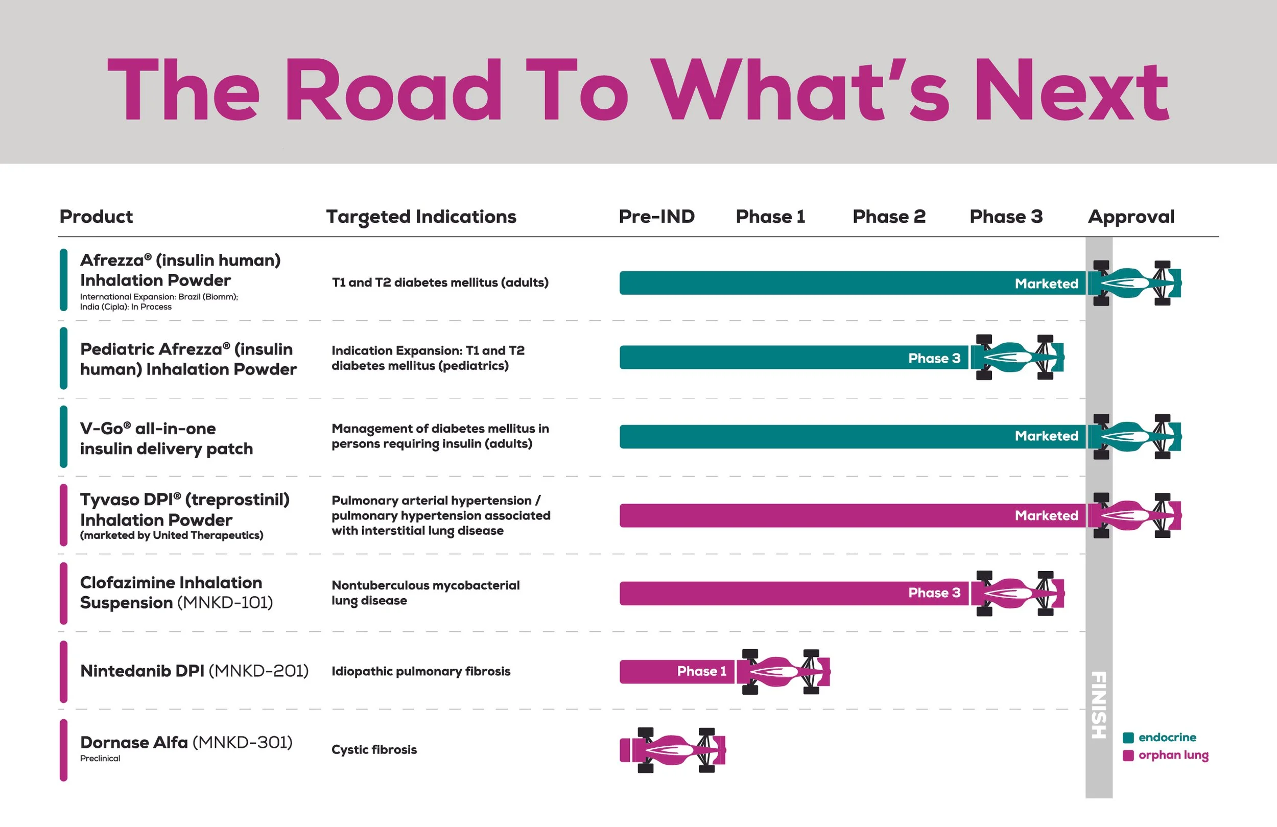
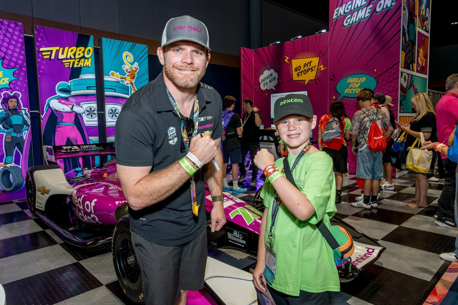
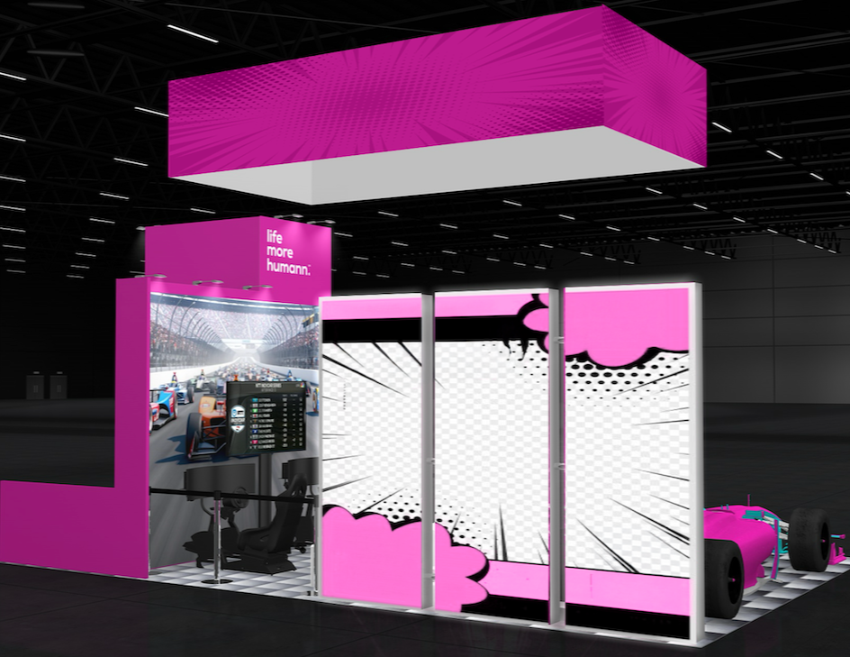
MannKind had reached out to us about a short-timeline project to create a booth and collateral design for their upcoming showcase at the Children’s with Diabetes Friends for Life Conference in Orlando, Florida. For the booth, they wanted to focus on MannKind’s values and mission while showcasing their NTT INDYCAR Series driver marketing partner, their replica racecar, and racecar driving simulator
The Turbo Team Design
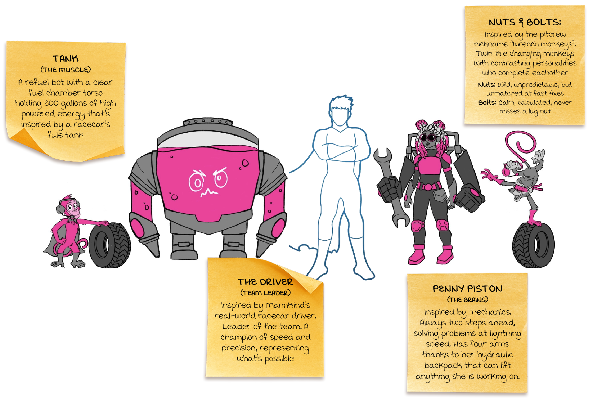
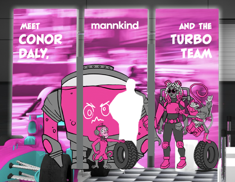
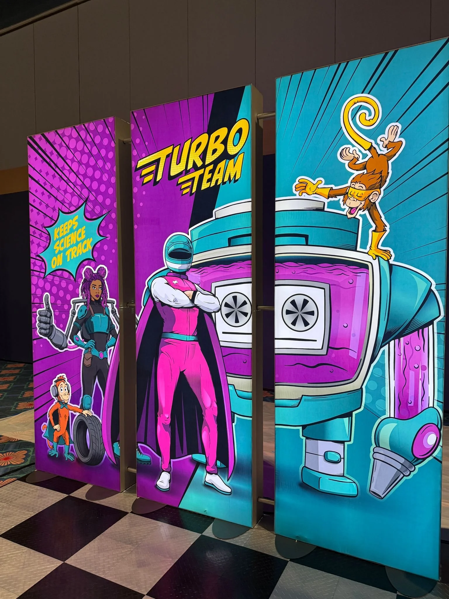
I centered the team’s design around the workings of a quirky and lovable pitcrew helping kids “stay on track” with their diabetes management.
Elevate the Original Concept
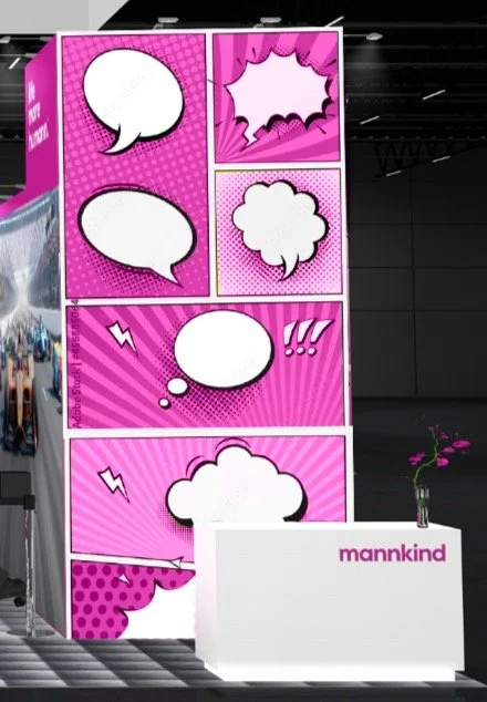
We wanted to create a booth centered around the year’s superhero theme showcasing comicbook styled superheroes. I was tasked with taking lead on the development of that team, the incorporation of them into the booth design, and ways to incorporate the comicbook style into the booths layout.
I thought, why not make it all connect? Bring in both the super hero conference theme and tie it into the NTT INDYCAR sponsorship. With guidance from my creative director we incorporated with Mannkind’s core values to hit all the marks.
The Team Name
Turbo being a way to encompany MannKind’s messaging of “rapid-acting insulin” in a fun superhero like nature while also being a play on words for racecar associations
“Speed is Our Superpower!"
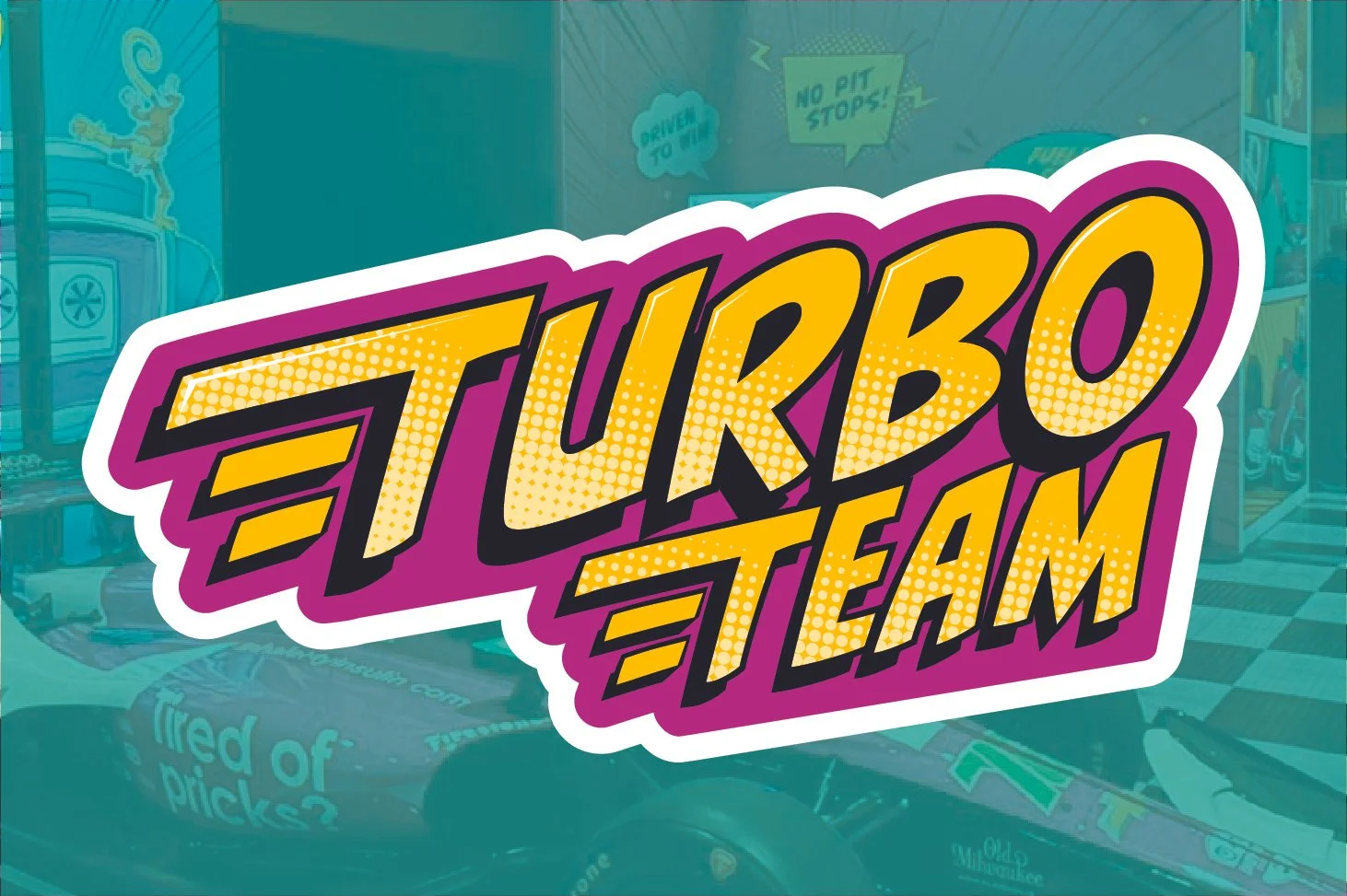
I created the accompanying Turbo Team logo to encapture a very comic-esque style with hints of subtle messaging of speed to link to the booth’s and MannKind’s messaging of “rapid-acting” insulin and the speed of a racecar.
Background
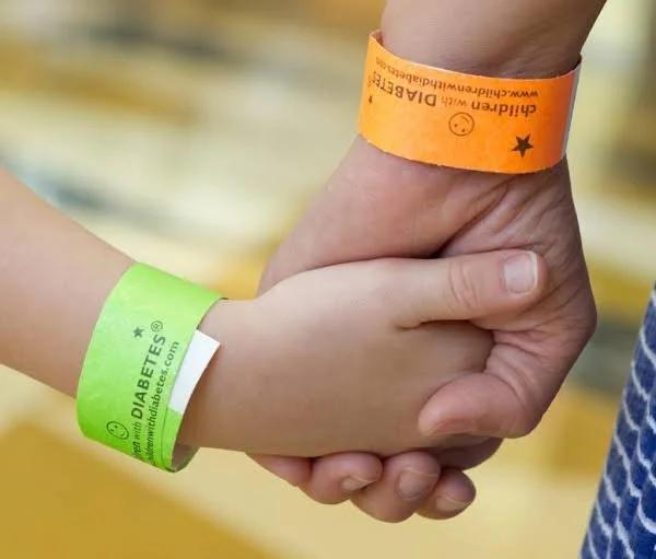
We met with MannKind’s Education Advocate who gave us background about the conference and the importance of it. She informed us the conference is very child-centered. About 3000 people attended - more then half have diabetes themselves the rest are supporting family members. It’s a place for people to connect with their community, meet new people, and share their stories, struggles and hopes for future treatments.
Our team had experience with MannKind so we were already familiar with their brand guidelines and how to use them to create designs that will fit cohesively inside their brand
Photography taken from childrenwithdiabetes.com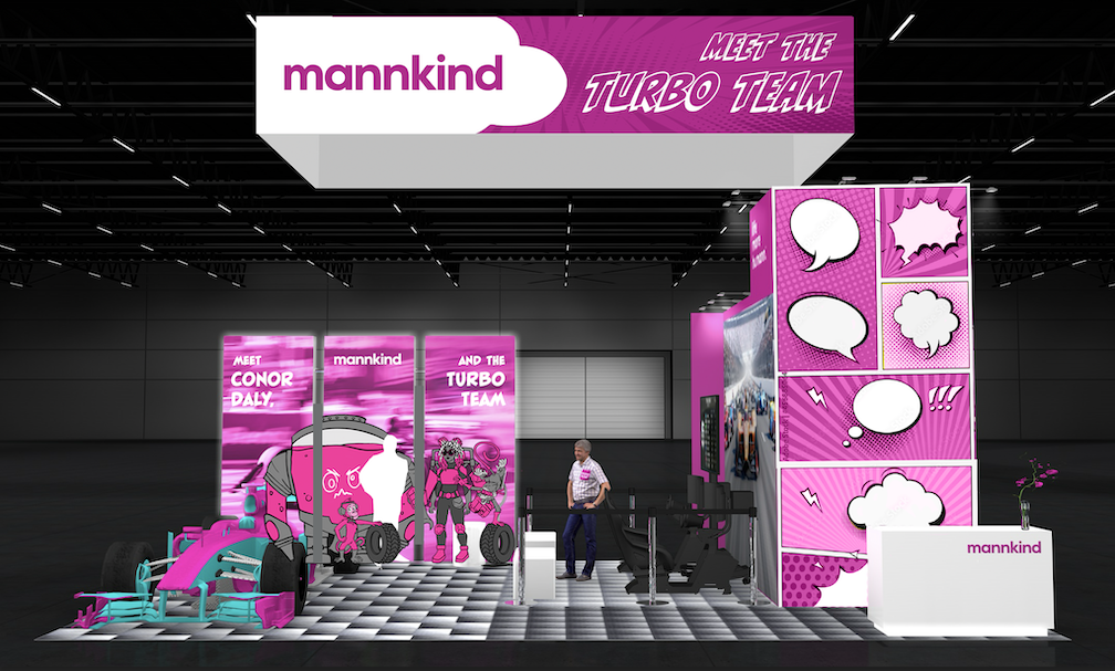
Trusting My Instincts
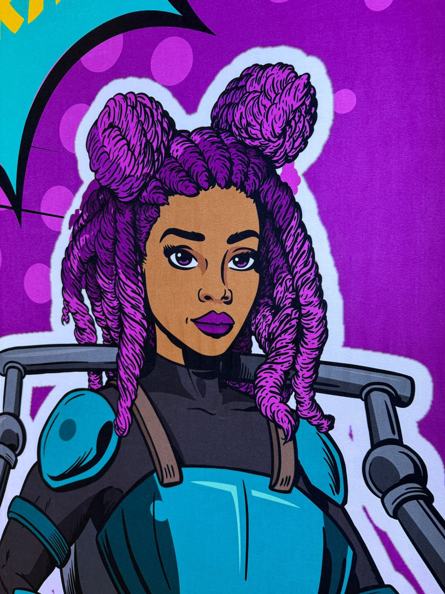
The biggest challenge I faced was advocating for the design direction I believed best served the audience, even when others initially pushed for a different direction. I collaborated with an incredible comic book artist who developed the final team illustrations, but I felt the comic-book styling had shifted the characters toward a more adult-gaze. While I pushed for revisions to each character - Penny was my primary concern as the only human character not modeled after a sponsor. I wanted her design to feel like someone they could recognize themselves in, rather than an idealized, adult interpretation of a hero.
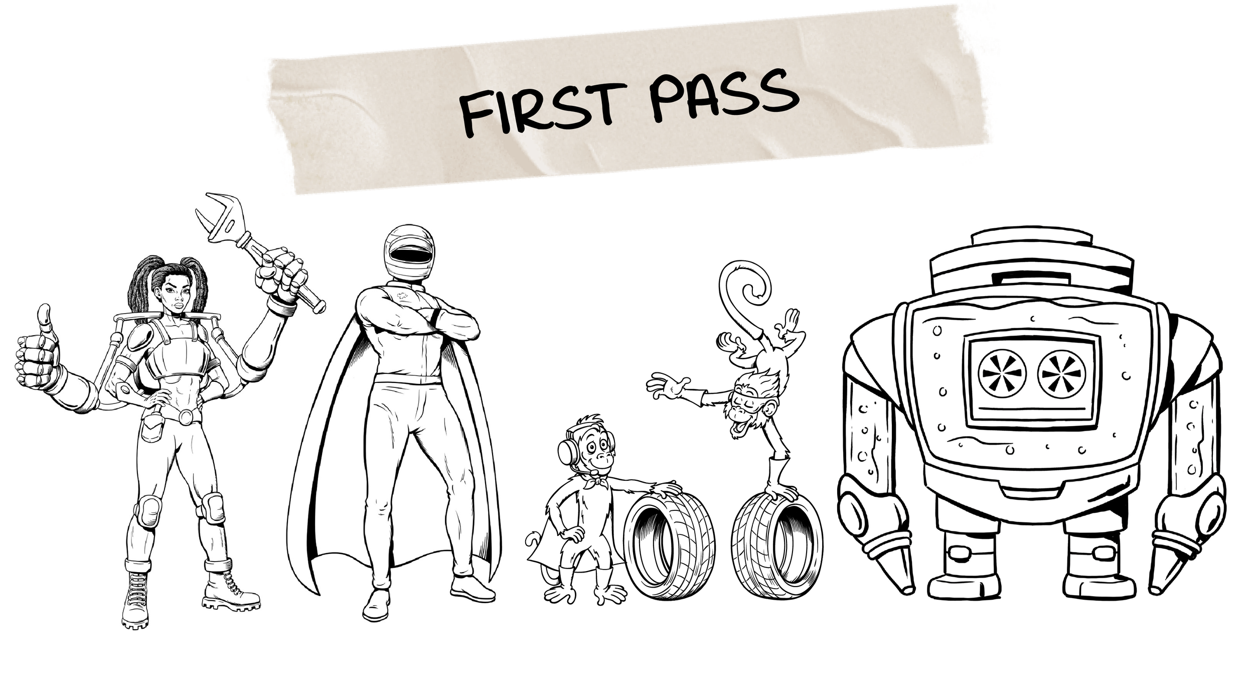
Our initial briefing emphasized that the conference was designed for children, particularly preteens and young teens, and I wanted that priority to be reflected in every design decision. I wanted the characters to feel approachable, expressive, and relevant to the audience they were created to engage. I brought these concerns to both the team and illustrator, advocating for details such as Penny’s space buns, a softened expressions, a more natural and relatable figure, and her signature bright pink hair.
While I advocated for myself a lot in this process, these choices helped reinforce the larger goal of helping young visitors feel represented, welcomed, and connected to the team.
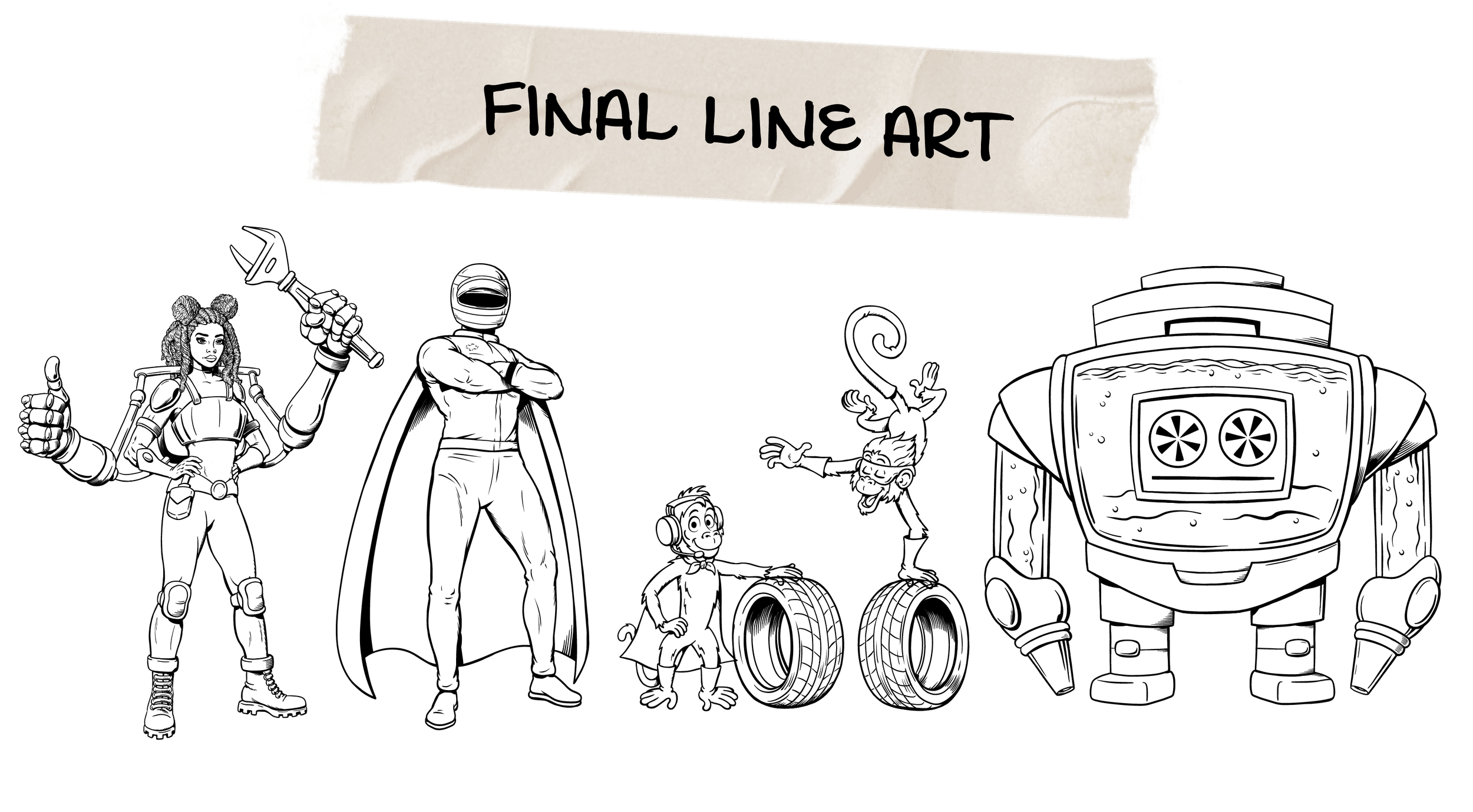
After my team and I made final tweaks and added color to each of the characters to match the style of the booth. Just like that the Turbo team were ready to be shown to the world.
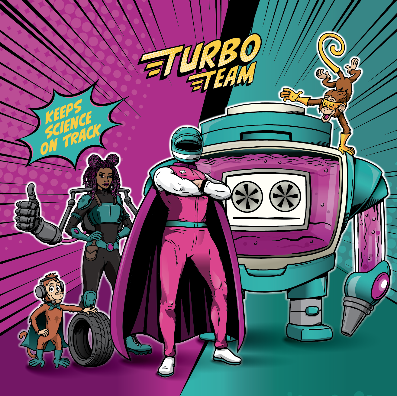
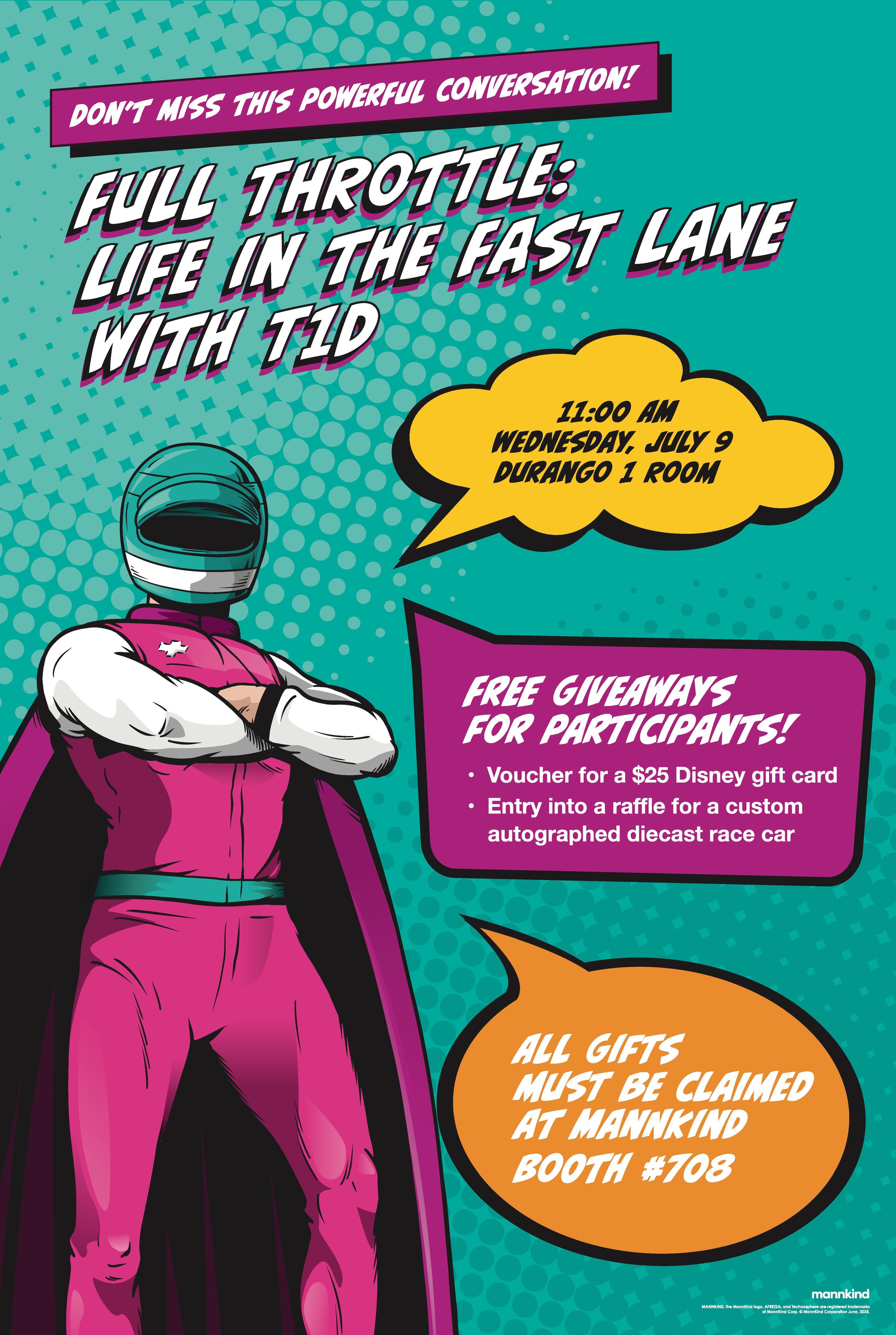
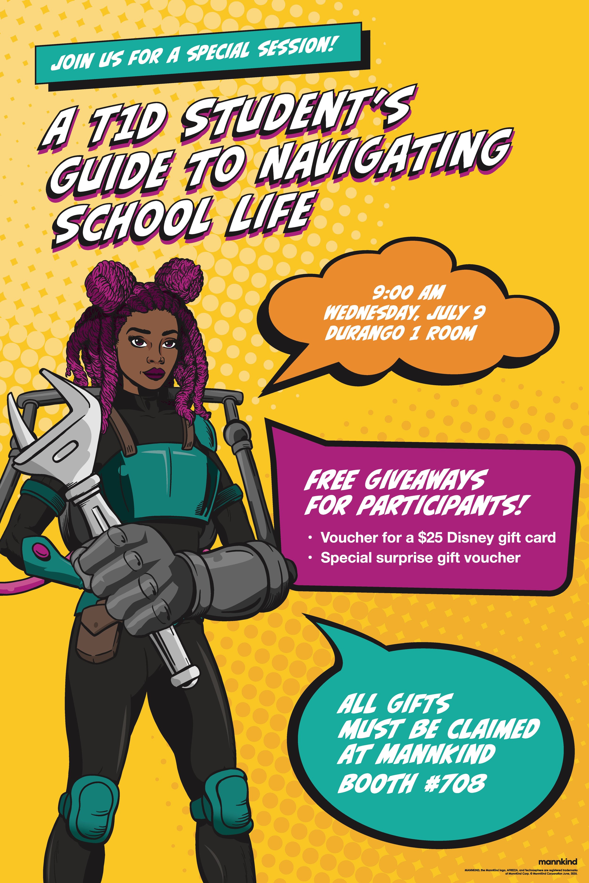
The Turbo team and their messaging was used not only throughout the entire booth but on all collateral created for the booth. With comicbook inspired circular textures to mimic mannkind’s branding, along with their iconic color pallet that mimics colorful childrens comics perfectly.
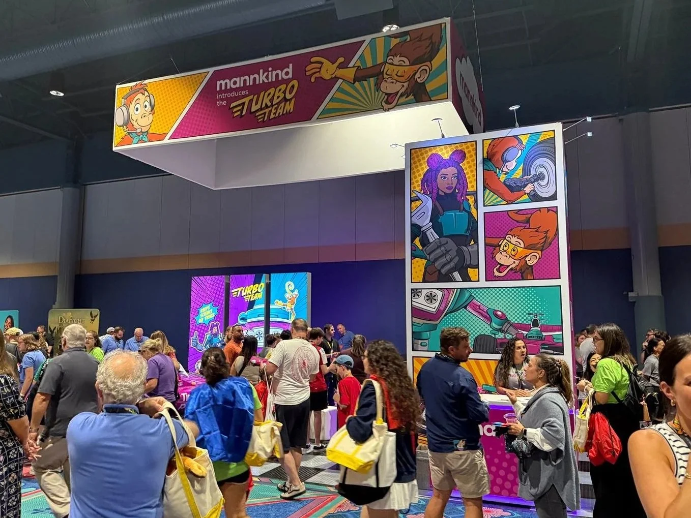
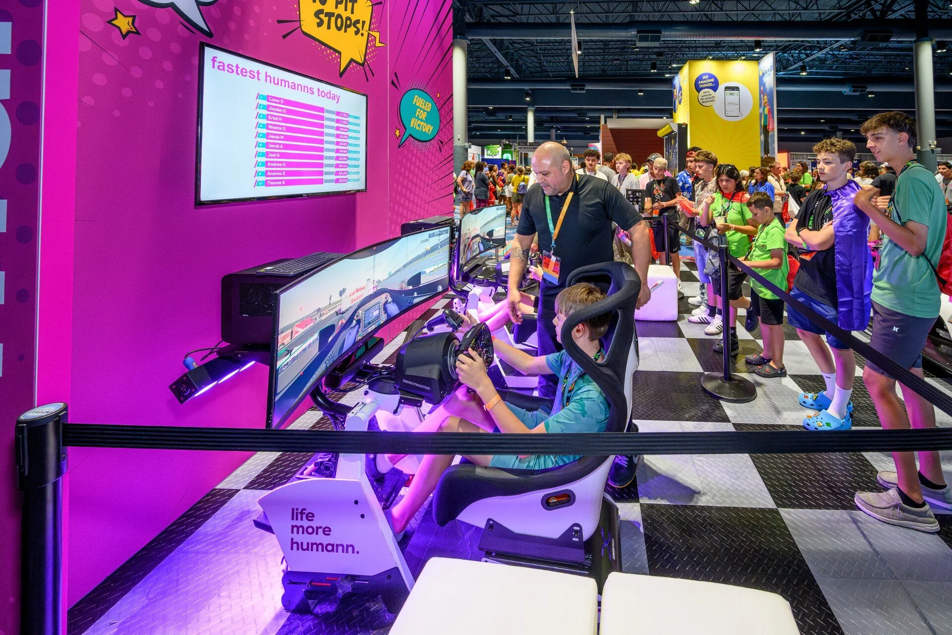
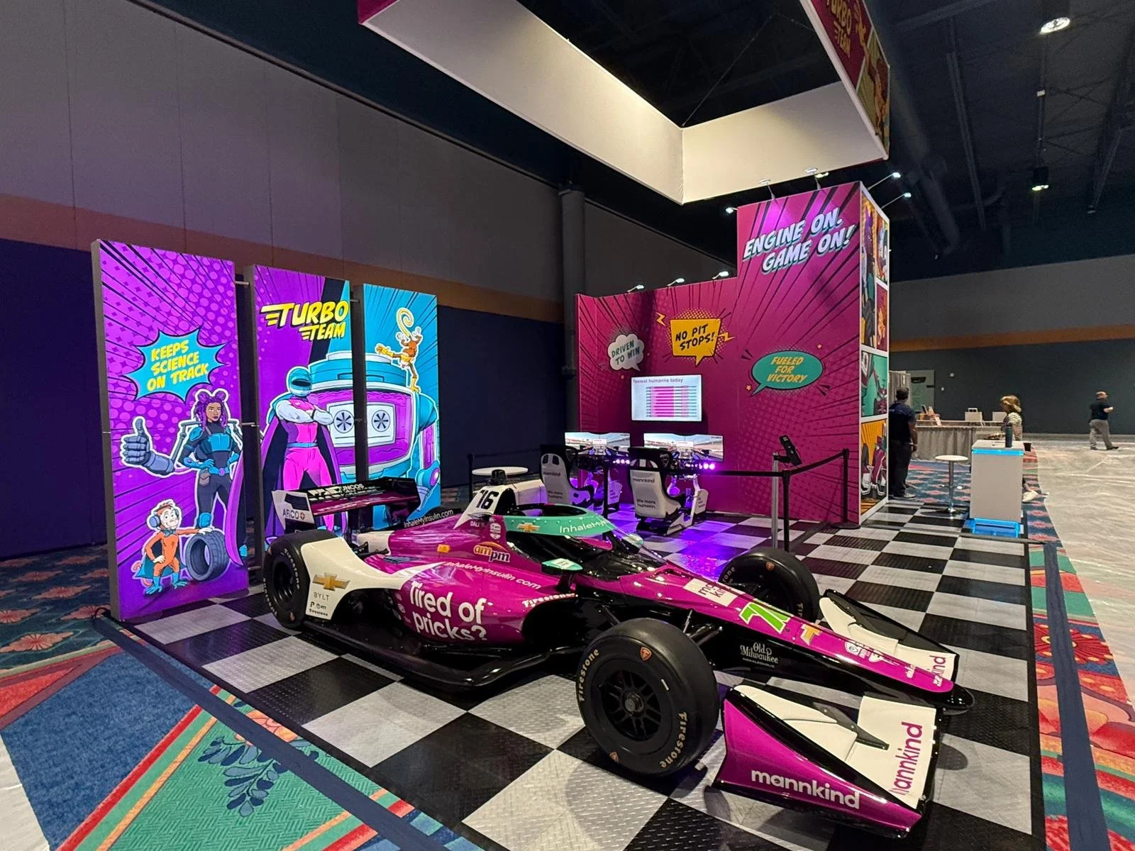
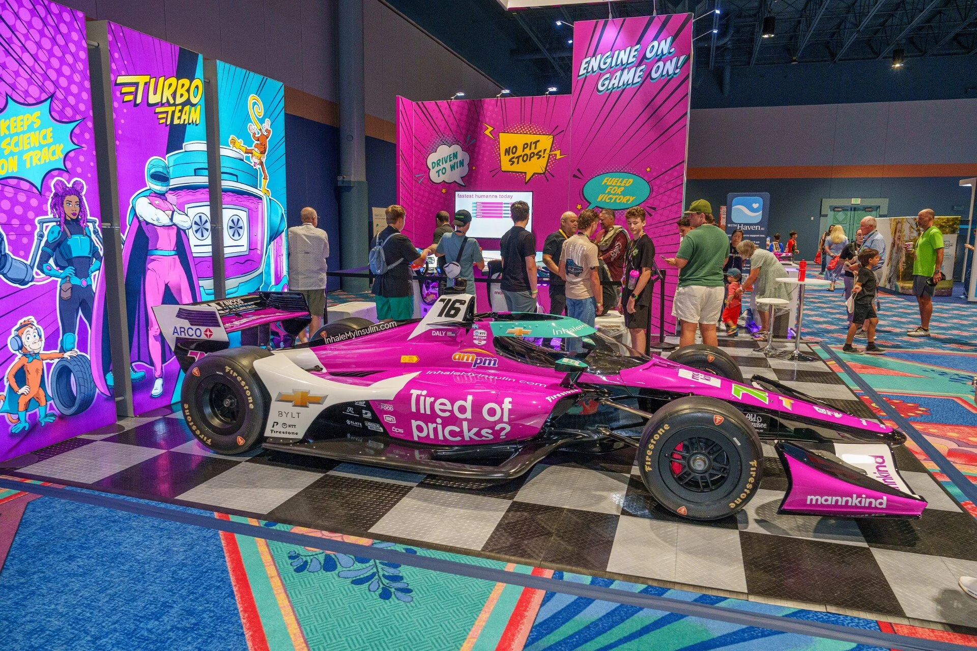
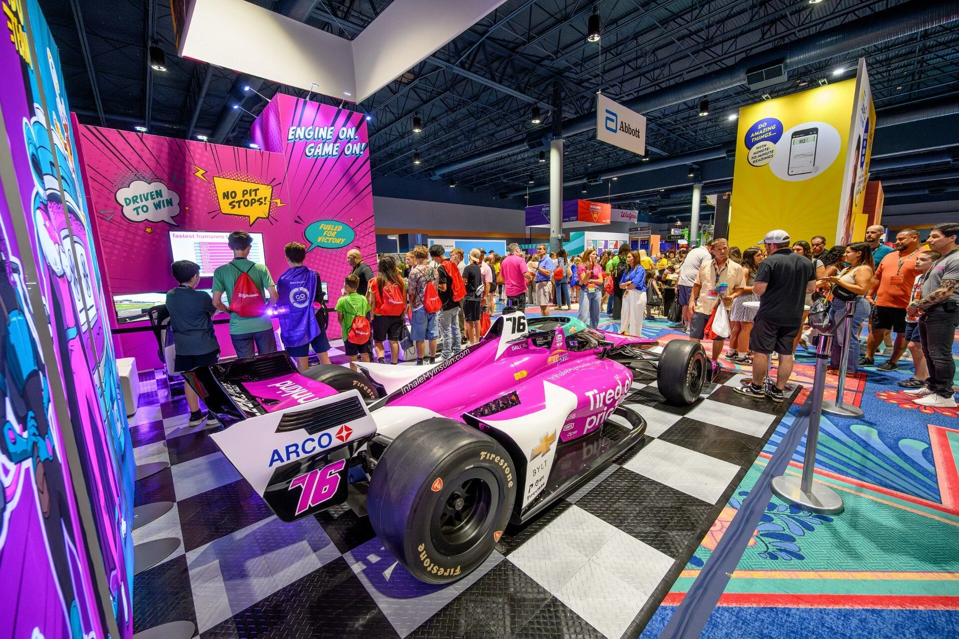
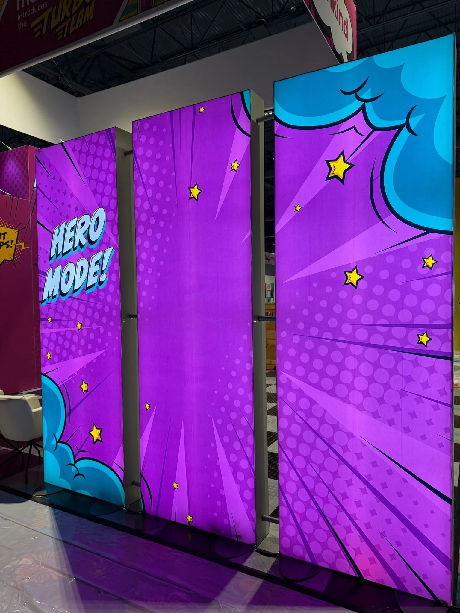
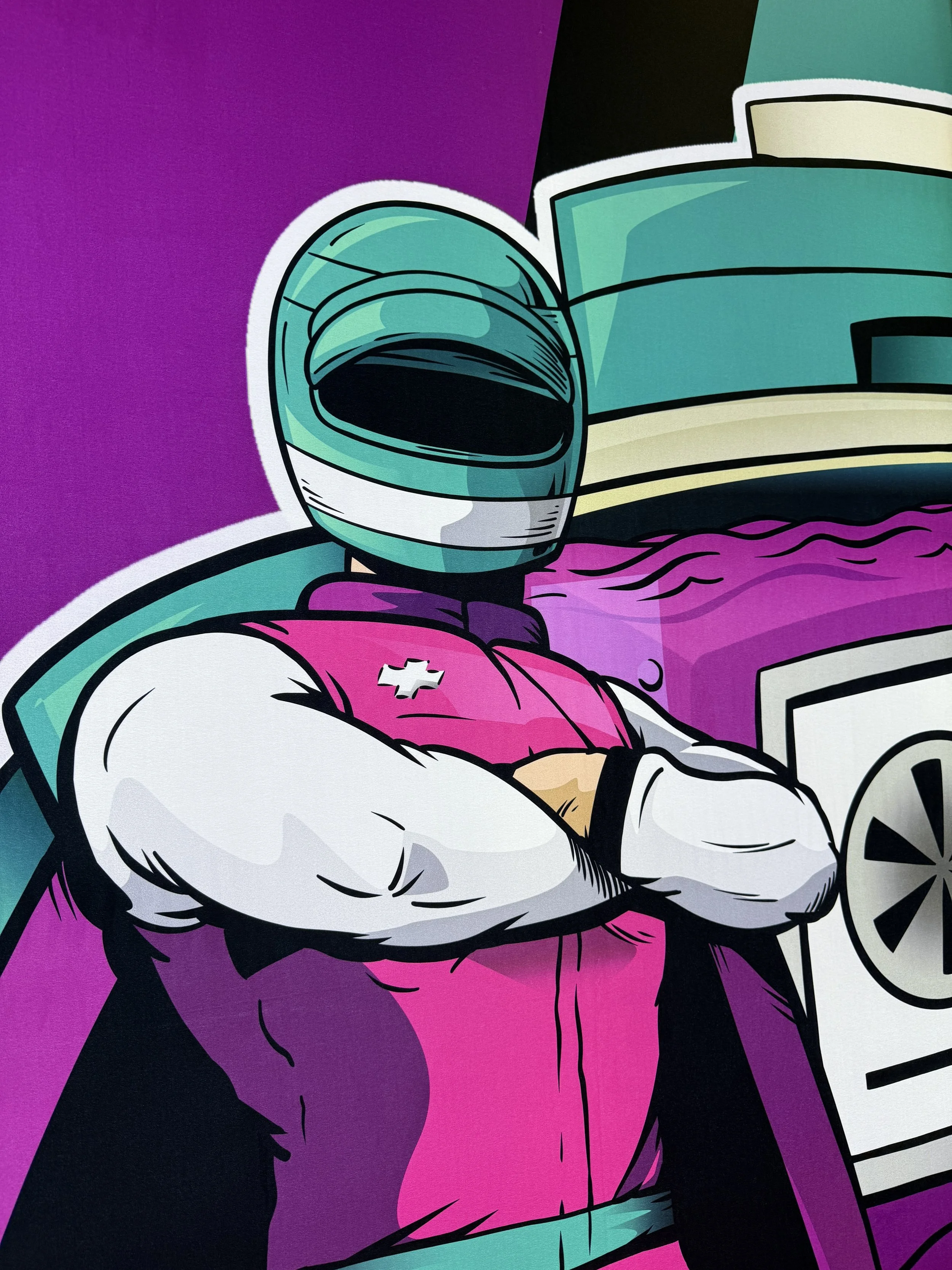
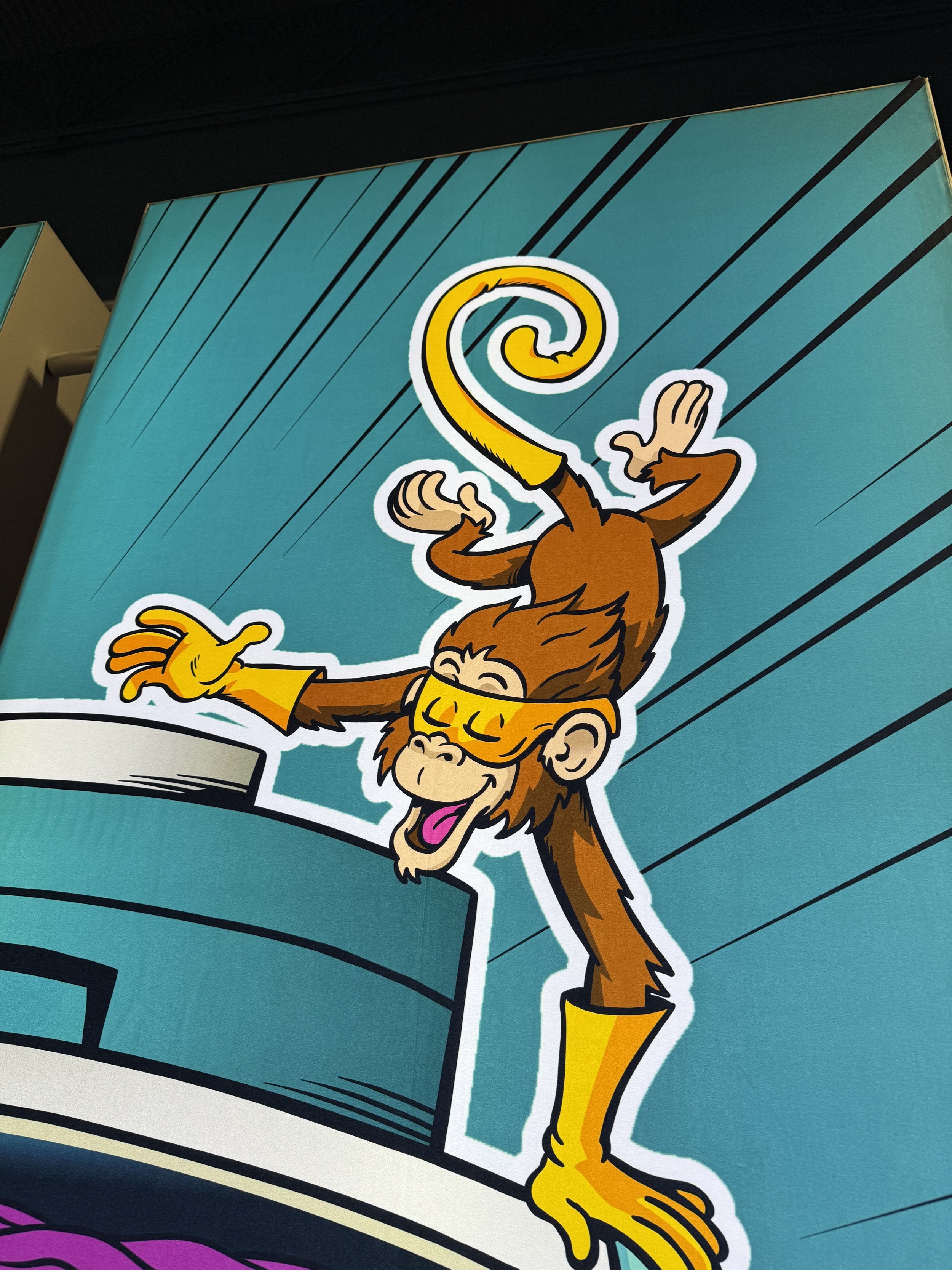
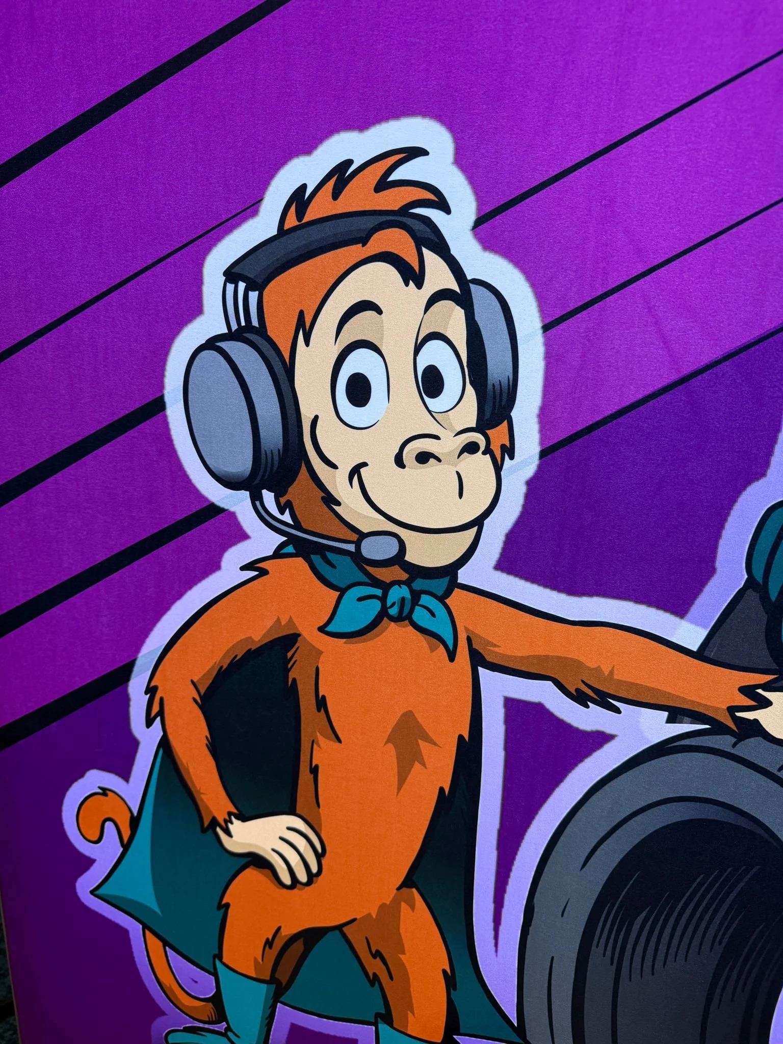
Creative Director who attended the congress reports it was the best booth there with the stickers and comic strip cards receiving lots of love and attention
Want to learn more about this project or discuss a similar collaboration? Let’s chat!